Typography
- samanzahra127
- Feb 26, 2025
- 1 min read
The right typography can convey a film's mood in a fraction of a second and set the viewer's expectations. From bold letters in action films to elegant scripts in romances, each font and style is chosen to match the story and evoke precise feelings.
Typography in drama films often features unique and impactful typefaces that reflect the mood and tone of the story. For our film, I thought we should choose a mellow yet sentimental font. The type conventional of classic drama feeler flicks.
I chose these as inspirations:
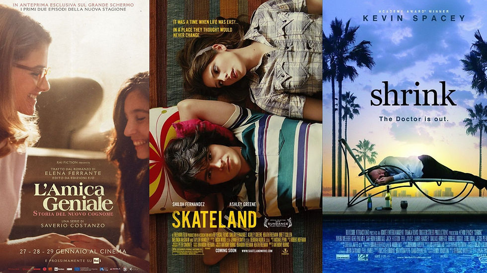
Each of them evokes a sense of depth and sentiment especially when paired with the images. These inspirations will perfectly encapsulate the journey we want to portray in the short film. It also has the dramatic flowy flair I love - not being a big fan of minimalism. So I take these as inspo for typography with the appeal to my personal taste and stylistic choice but also the perfect fit for the conventions of drama typography they are.


Comments